Human Senses Icons
2019 Autumn Semester: Introduction to Visual Communication Design with Oscar Fernández
The Human Senses are depicted below in the form of a line or a circle. Iconography is about displaying a concept in its simplest form. I created icons that reflected the verbs stripped down to the core meaning of the sense. How can I capture the essence of touching, smelling, hearing, tasting, and seeing in just a simple icon?

Touching, smelling, hearing, tasting, seeing
Human Senses Symbols in black and white as well as an additive of color. While designing with color, I felt it was important where to apply the color. I carefully placed the color in the areas that the object comes in contact with the anatomical features.

color exploration
Icons Dissected

touching
The icon resembles the effect of touching an object whether it be a vibration, something hot or cold, a zap, etc. I wanted to explore the touching interaction.

smelling
I investigated the idea of something entering in and causing an effect. The outlined dots serve as debris or mist causing a reaction of satisfaction or completion with the filled in dot.

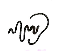
hearing
The lines serve as a vibration or perhaps a sound wave entering into the ear and causing an effect. The colored lines represent the moment the sound hits the earlobe and what that might cause noise may cause.

tasting
I intended on the yellow filled in dots to represent something sour or sweet, hitting the taste buds and causing a reaction.

seeing
The pupil of the eye is reacting to the outside world through the intensity or harshness of the sun, creating different light variations and color. I designed this to show the effect of light hitting the eye.
Children’s Zoo Icons
I further created three root/determinant symbols from my initial "seeing" symbol. Students were instructed to select a current completed symbol and apply a determinant graphic element to modify its meaning. I was assigned Children's Zoo, and designed the determinant symbol accordingly.

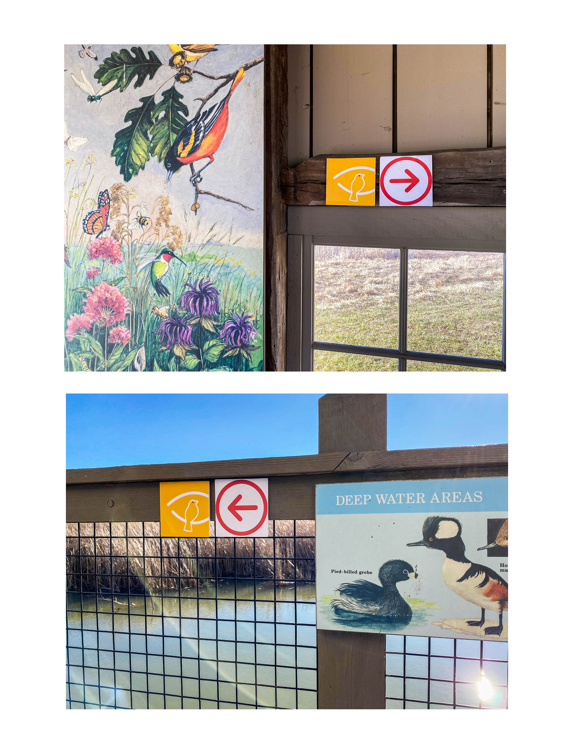
Wayfinding
For the final parameter of the human senses symbol system, students were advised to choose one of our root/determinant symbols and apply a directional arrow. I chose my "Bird Watching Park" symbol and applied a stylistically similar arrow, forming a way-finding system.

Sketches to illustrator
In the series below, I developed ideations of the icons in the initial sketching phase and then applied the sketch concepts to illustrator. Our professor allowed for 30 minutes of sketching to encourage us to quickly put down ideas with the goal to eliminate overthinking the sketching process. This tactic has become a key part of my design process today.